Candied Hearts (Demo)
Improved Readability (Old Demo vs Revamped Demo)
Hey y'all! Today, I wanted to quickly go over the game's readability and accessibility, as well as the improvements made you'll see in the revamped demo.
In the 2023 demo, one of the biggest points of feedback was some players were unable to read the game text because of how small it was or that it didn't contrast well enough with the textbox's color. And for me, some is just too many people. So one of our goals when revamping the GUI was to make sure it improved on the shortcomings the old one had.
Below, you can see the old UI vs the new one! Please keep in mind that this is with the default fonts. The revamped version will keep the option to switch typeface from the default to either Atkinson or Open Dyslexic!
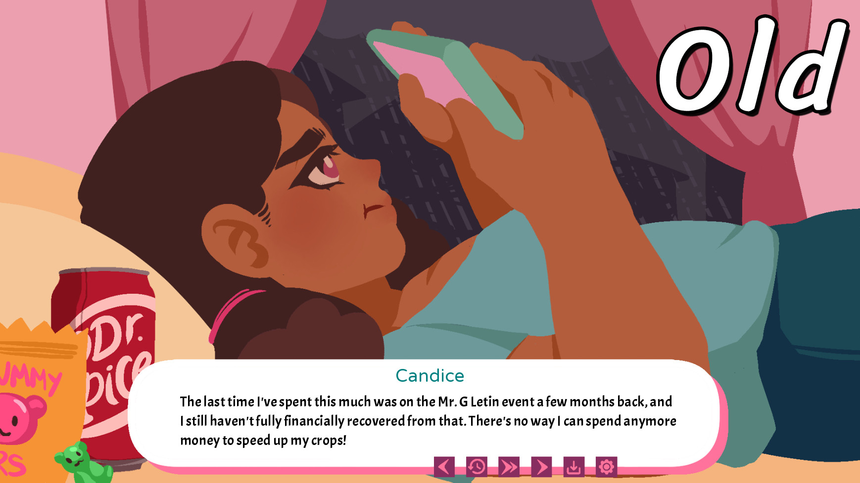
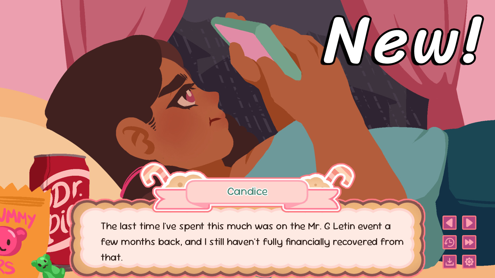
As you can see, the font's MUCH bigger, has increased spacing, contrasts a bit better, and most important, has less words in each block (depending on the dialogue block).
We hope that these changes make for a more pleasant experience for all!
Comments
Log in with itch.io to leave a comment.
Such a wonderful improvement!
1000%! The difference is night and day! Super proud of the improvements we made. :D
It looks great omg!!
Thank you so much, Yuri! :D